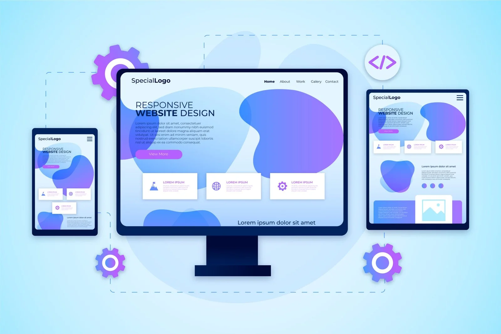
With users accessing websites from desktops, tablets, and mobile devices, responsive design is no longer optional. It ensures your site looks great, performs flawlessly, and keeps visitors engaged regardless of device.
Key Responsive Strategies:
- Flexible Grids & Layouts: Design layouts that adjust dynamically to any screen size.
- Optimized Images & Media: Reduce file sizes without losing quality for faster load times.
- Touch-Friendly Elements: Ensure buttons, forms, and menus are easy to navigate on mobile.
- Simplified Mobile Navigation: Streamlined menus improve usability and reduce bounce rates.
- Cross-Device Testing: Regularly test across devices to maintain consistent performance.
Impact on Conversions:
Responsive websites retain users longer, improve engagement, and increase conversion rates, ultimately boosting business performance.